As we have previously highlighted (see links here, here, and here especially) the Epsom & St Helier Trust has produced a document they call their "Estates Review".
The document is riddled with contradictions, some of which we will go into elsewhere. It appears to have been drafted to give the impression of a hospital trust whose buildings are not fit for purpose - presumably to justify the closure or demolition of our local hospitals.
The estates strategy document was published on the 26th of June 2015, the same day as a Trust Board meeting - prior to that point, a draft version existed which was similar but crucially, not exactly the same.
KOSHH were present at the board meeting in question, and were therefore able to see a copy of the draft version of the document. When the published or final version was later published on the Trust's website, a few noticeable differences were apparent.
Here is a snippet taken from the draft version:

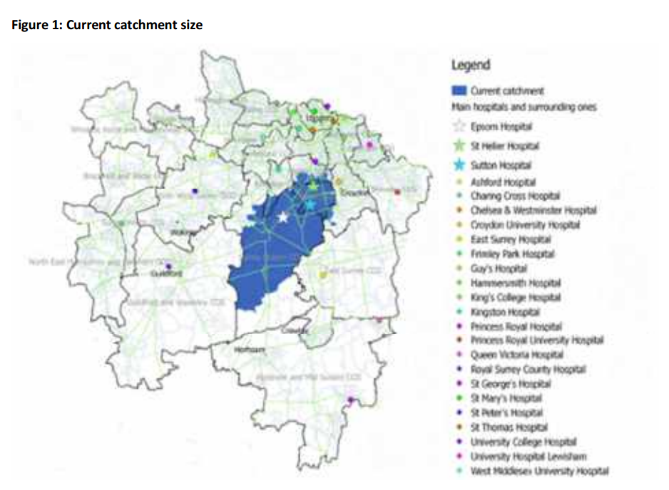
Draft version - Map of Catchment Area
Above we have a page from the Draft version, containing a map showing, the local area, and markers have been placed to indicate the location of Epsom Hospital & St Helier Hospital. Also marked is Sutton hospital, but as you can see from the image in this post, there really isn't much left of Sutton Hospital these days.
When we look at the published version however, the quality has deteriorated significantly, and this same page now looks like this:
Release version - Blurry map of catchment area
As it might be difficult to see what we mean, we have zoomed in to the text of the above and placed the two versions side by side. The Draft edition is on the left, and the published edition is on the right:
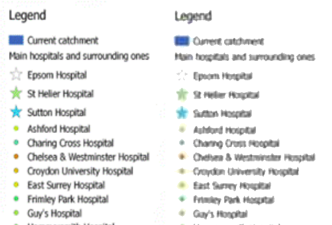
A bit of loss of quality there is clear to see, but if you squint a little bit you can, at a push, just about make out what the writing says. Let's move on to the next one:
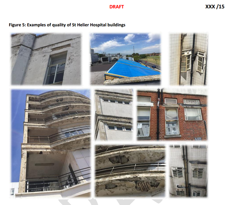
Draft - External photos of St Helier hospital
The keen eyed among you will notice a familiar picture of a blue tarpaulin which we've already discussed in detail here.
The above clipping from the draft edition shows some photos of areas of the outside of St Helier which have clearly been neglected by successive managers at the Trust, but the images are nonetheless quite clear in the draft edition. Something strange happens by the time this becomes the published edition however:
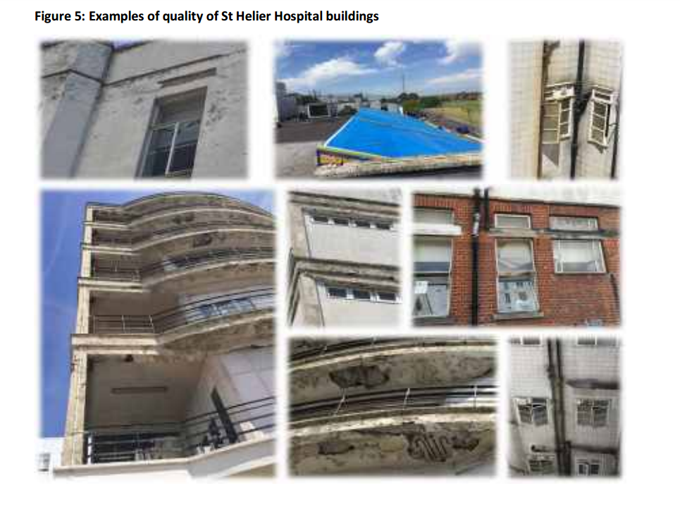
Again, it might be hard to tell from the small images above, so here's a side-by-side comparison:

Photos - Side by side
But, since none of the above is really telling you anything about whether or not the building is fit for purpose (although it does document neatly the neglect which the buildings have been treated to for years) - perhaps it doesn't matter all that much.
The same however cannot be said when the "image" in question is about cold hard data. Facts rather than pictures. Which is perhaps why we were concerned about the next case:
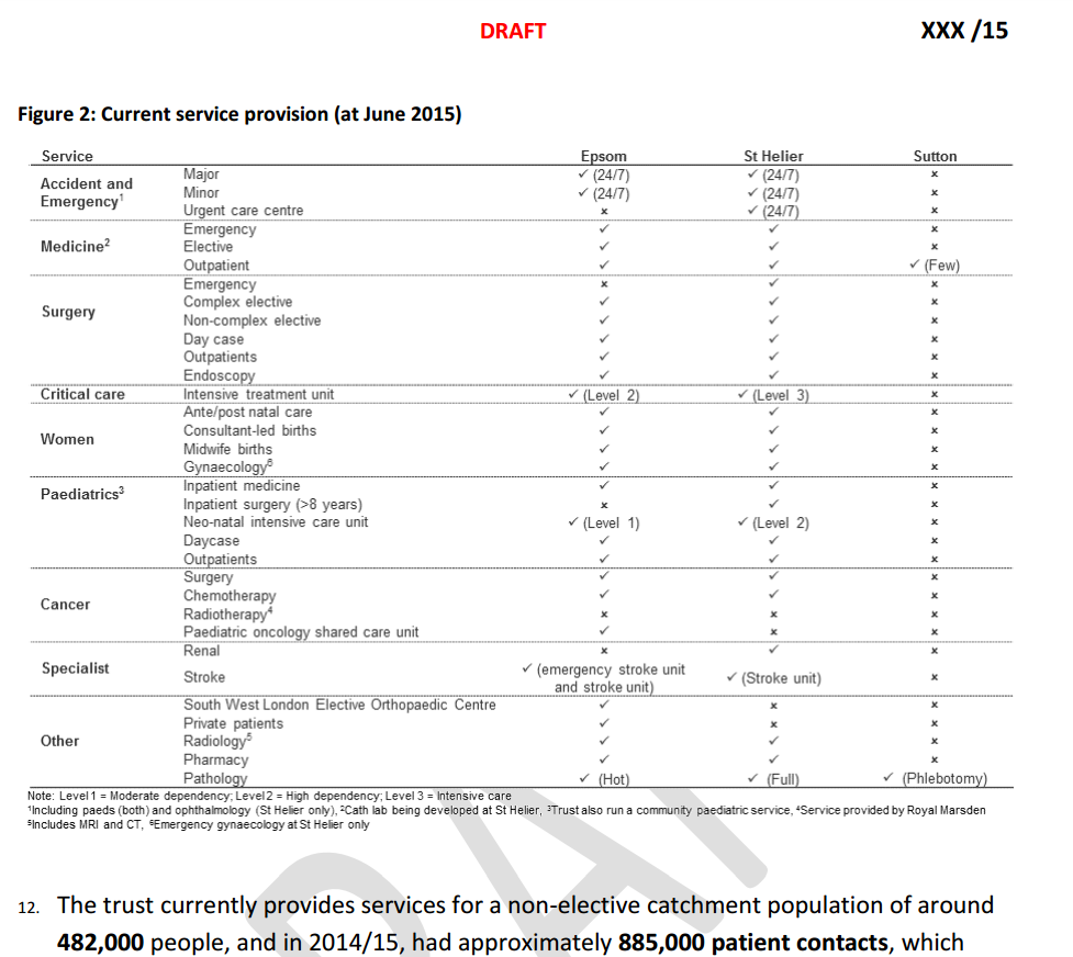
Draft version - Table showing details about service provision at the Trust
The above table from the draft edition is nicely rendered. No noticable blurring or smudging. Quite easy to read etc. But once more, something odd happened to the document before it was published:
Published version - Table NOT showing details about service provision at the Trust
In the published edition, this particular table of information is rendered completely unreadable. For clarity, we've produced the following animation of the two versions of this image.
Like all the images in this post, you may click the one below in order to see a bigger version of it.
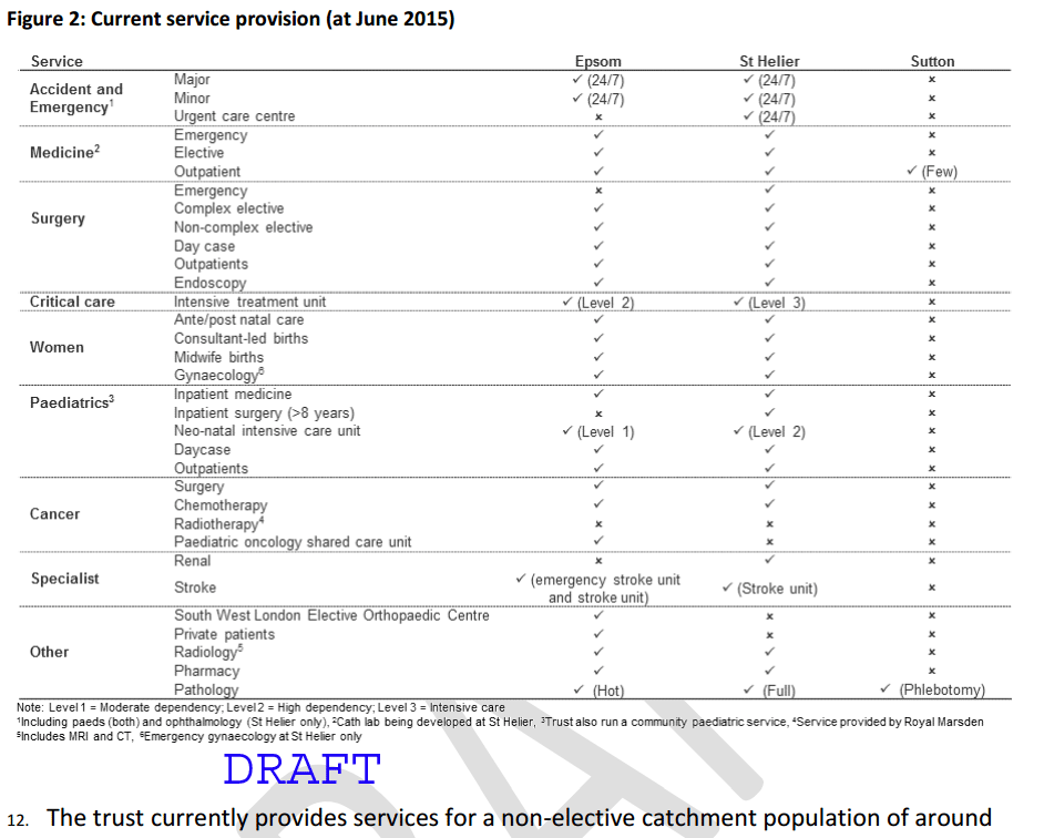
Here we have a table of data, which the original authors of the report felt the need to include, but somewhere between the Draft edition and the Released edition, something was done to the image which made it completely impossible to read.
This means that anyone who downloaded the released document from the Trust's website, and went on to comment on it, was completely unable to see what this table should have contained.
Because this was important, and significant error on the part of the Trust, KOSHH campaigners have repeatedly, and publicly asked for the trust to correct this problem, but no such change was made. Please click on either of the icons below, where you can download the Draft edition, or the released edition, in full, for your reference.
Since the Trust were aware of this problem, and did nothing to remedy it, one has to wonder if perhaps something else was going on. Despite the blurriness, what is absolutely clear, is that nothing in this document justifies the closure and potential demolition of our hospitals.
Surely the trust didn't actually want people to respond to their document without being able to read it properly?
Update: 20/04/2016 click here:


